Social media platforms combine the main types of communication with the audience – text, visual and video content. Every one of them plays a specific part in promoting your brand.
Texts give more depth and vision to the matter, yet it takes time to read; video is a quick and engaging way to convey the message and spice up a blog a bit, yet you need time to watch and listen to it; and visuals have a medium position, being catchy and informative simultaneously, giving you the chance to grab the main idea, in the quickest way possible.
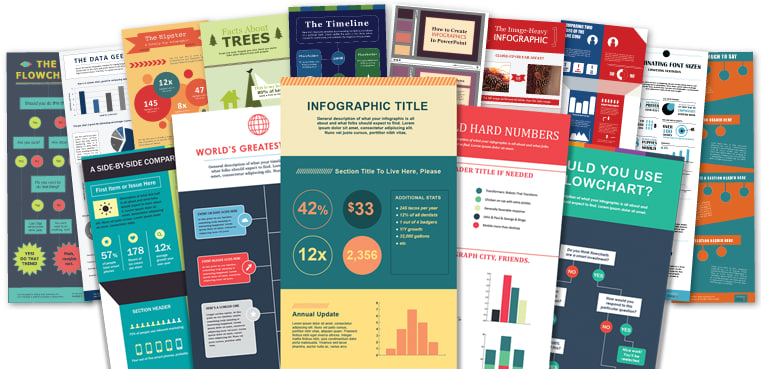
One of the most beneficial forms of visuals is an infographic, as it is engaging and semantically loaded. It complements the blog or page in many ways:
- Complements the brand.
- Reduces bounce rate.
- Catches and keeps the reader’s attention.
- Saves time in processing the information.
- Improves SEO ranking.
The infographic will serve the brand or page greatly provided it’s well-planned. The main stages of its development include:
1. Define the aim
Every time you get down to creating new content, you need to question its purpose, and why you need it in the first place. The best way to set the goal is to use a SMART approach:
- Be Specific,
- Define how you can Measure your influence and if your objectives are Achievable,
- The idea must be Relevant to your brand and reached within certain Time frames.
Such an algorithm helps to direct all your efforts toward reaching and engaging your target audience.
2. Type of infographic to use
The type of infographic depends on your content and its aim. The are a few basic structures to use: list, mind map, informational leaflet, statistics, timeline, process, ‘how-to, comparison, etc. After you define what you need, check the infographics by VistaCreate and pick up the template which meets your requirements.
Make sure the template matches your data and overall style of content.

3. Collect your content and relevant data
The most important objective of the infographic is to make all the “get-to-know” experiences easier and quicker. After you are ready with the information to present, you need to convert it into a brief and comprehensible note:
- Identify the pieces of information that can be turned into visuals, like, numbers, facts, dates, and figures, because they can be showcased with the help of graphs or diagrams.
- When the essentials are selected, remove all the other “watery” information, as the infographic doesn’t tolerate a novel-like style.
Each word on the visual matter has value, thus, it’s important to be scrupulous and change the text and word combinations until you reach the perfection and smoothness of captures.
4. Follow the consistency and hierarchy of the elements
The usage of hierarchy helps to reach a layout that is pleasing to the eye. The elements are scale, color, contrast, alignment, and proximity.
The title is always the biggest, as it is an eye-catcher; sub-headings are a bit smaller than the title as they create separate categories; texts are mainly used with 14+ pt, not to be too small and be easily readable.

5. Consider the color psychology
Wrong colors will ruin the whole strategy and idea. Every color has an emotional load, it evokes the feeling of happiness, sadness, enthusiasm, nostalgia, etc. Therefore, it is important to understand the psychological component behind every color not to confuse the readers or send the wrong message.
As a rule, there are two ways of color usage:
– to match it with the brand colors, which will complement the brand image;
– go the opposite – use contrasts, which will make visuals more appealing and catchy.
6. Images
The images that are chosen for the infographic must always have a high resolution. High-quality photos make the infographics visible, and attractive and complement the aesthetic component. If you use low resolution, everything will look blurred, and the whole process will just lose the point.
Besides, you need to keep in mind the copyrights, thus, explore and use only royalty-free photos, so as not to be obliged to pay fines afterward.
7. Publishing
After everything is arranged, edited, re-edited, and agreed on, you can proceed to the final stage – sharing the infographic with the world and promoting it.
Infographic is a valuable source of information and a practical tool for conveying information to the reader. It is short and clear and contains essential information alone, thus, there will be no place for clutter. Readers of the blogs give preference to the infographics, compared to the text, as it is a quick way to get the necessary information.
The whole creating process will not take more than an hour or two, provided that you already have the data to be presented. Just choose the right template, organize the blocks of information, work on the fonts, their sizes, and color schemes, and the visuals are ready to see the world.

