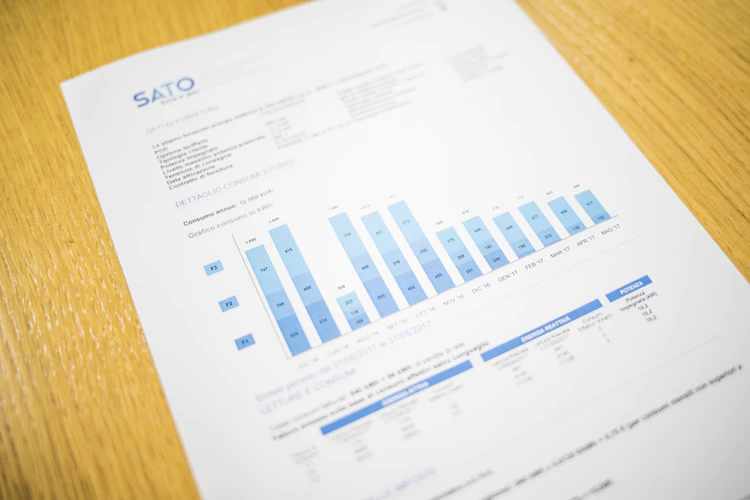
People live in a visual world, and infographics help them understand data better. In real estate, agents need to be creative to look like rock stars to their clients and sell more properties. One of the tools that can make a real estate report impressive is by using graphs.
But do you know how to use a graph maker, such as Venngage, to make your report look understandable and nifty?
Let’s say you have all your materials and data prepared for your clients. You have covered all the information, statistics, and updates you need to catch their attention. What you would only need are better visuals to make your report pleasing and easy to comprehend.
Why are graphs important when presenting data?
When presenting quantitative data to an audience, one of the best ways to understand them is through graphs and charts. They compile large amounts of data into understandable formats. These can help one’s audience understand the data clearly and effectively. Because let’s admit it, if you’re the customer, you don’t want your agent to keep beating around the bush.
So how can I create graphs to make my report impressive?
The great thing about using Venngage for creating graphs is plenty of available and ready-to-use templates are on the website. With just a few clicks, you can input all your data, numbers, and information to create reports that will capture your audience’s attention. However, if you don’t know how to use graphs, don’t fret. We will teach you the basics of using charts and make your report stand out from other real estate agents.
Choose the right graph for your report.
For first-timers, creating graphs can be intimidating. The first challenge after gathering all your data is choosing the correct type. There are plenty of choices, so we have lined out six graphs that can make your data storytelling effective.
- Vertical Bar Charts

This common type of graph is mainly used for categorical data presentation. In no particular order, these bars on the chart can include data such as months of the year, age group, etc.
- Horizontal Bar Charts
Contrary to the column graph above, horizontal bar charts compare the mean or percentage of eight or more different groups. This type of chart should compare mutually exclusive groups.
- Pie Graphs
For single dimensions, you can use a pie chart to illustrate data correctly. For one variable, pie charts can effectively show the difference between groups or categories.
- Line Graphs
If you want to show the long-term progression of sales or empirical statistics, you can use line charts to show trends over time. Line charts are the best type of graphs to compare two different variables.
- Scatter Plots
For competing variables, using scatter plots can determine how different groups settle around a mean based on two or three different dimensions. It can allow your clients to quickly compare the differences between objects or their relationship to the average.
- Histograms
For the last type of chart, you can use histograms to illustrate dimension measures with discrete intervals. In simple terms, it is used to show a simple breakdown of sample distributions in one dimension.
Make sure that the layout is clean and uncluttered.
It is a fact that our human eyes can handle a few things at once. If you have plenty of variables in your graph, your client may start to lose interest. With this in mind, you have to maintain clean and simple visuals to deliver your message clearly to your audience.
You should also allow enough space so that the display doesn’t look crowded. Doing this will also allow the texts to stay large enough for your reader to comprehend well.
Use Color in a Uniform and Meaningful Way
When comparing variables, using color is a powerful tool to let your readers understand information. Colors in graphs help readers pick out important points. But if you overdo your colors, it can confuse your clients.
Stick to a color wheel. Though there are plenty of colors to put in your graph, you should always have uniformity with your color. If you are consistent with your color palette, it can attract and retain your audience while delivering your report.
Let this cold color palette be your reference when picking the right shades for your graph or chart:

Another tip to consider when using colors is to keep them consistent throughout your report to avoid confusion just like you did for your room while choosing colors from ralph lauren. For instance, when you use green for the symbols that indicate the best performance, do not use green elsewhere in your report to designate another variable.
When using a graph for your real estate reports, keep your design elements clean and understandable so that one can understand the importance of living room, bedrooms, decks, and backyard. That being said, Venngage is always ready to help you create and supply graphs that can keep your clients from scratching their heads.

